I was tasked with simplifying the MyAmFam app enrollment flow down as far as possible, with the secondary goal of bringing about parity with the web version of enrollment.
Results
I cut down the 12+ screens to a mere 5, achieving the primary and secondary goals of simplification and parity. I also made sure the flow was using our current design system as well as meeting WCAG 2.1 AA accessibility standards.
Who
Myself, UX Designer
Danni Oster, Content Designer
Bernie Coens, Experience Owner (BA)
Why
Old version was "frustratingly long" according to surveys- each field was on a separate screen
Business desired a consistent experience with the web version
Ample room for improving accessibility by eliminating the need to remember content between screens, among other improvements
How
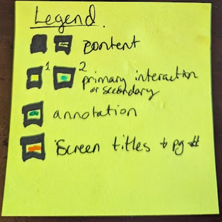
Created a map of the ideal information architecture and decision tree
Sketched out happy path of screens to get approval from management
Iterated several times on high-fidelity versions thanks to feedback from design team
Information Architecture Mapping
Low-Fidelity Sketches
First Pass in High Fidelity
Final Handoff (to Design Team)
Want to flock together?
If you like what you see and want to work together, get in touch.